BEEZBEE REBRAND
CBD Kratom | 2024 - 2025
This project's purpose was to rebrand beeZbee into a more adult-looking (but still playful and approachable) brand. It was also requested to minimize colors used so it's less chaotic to look at all at once (see the bottom of the page for old branding). A logo update was also a must. With a wide range of products and cannabinoid content, this brand was a fun challenge to tackle.

THE LATEST ITERATION
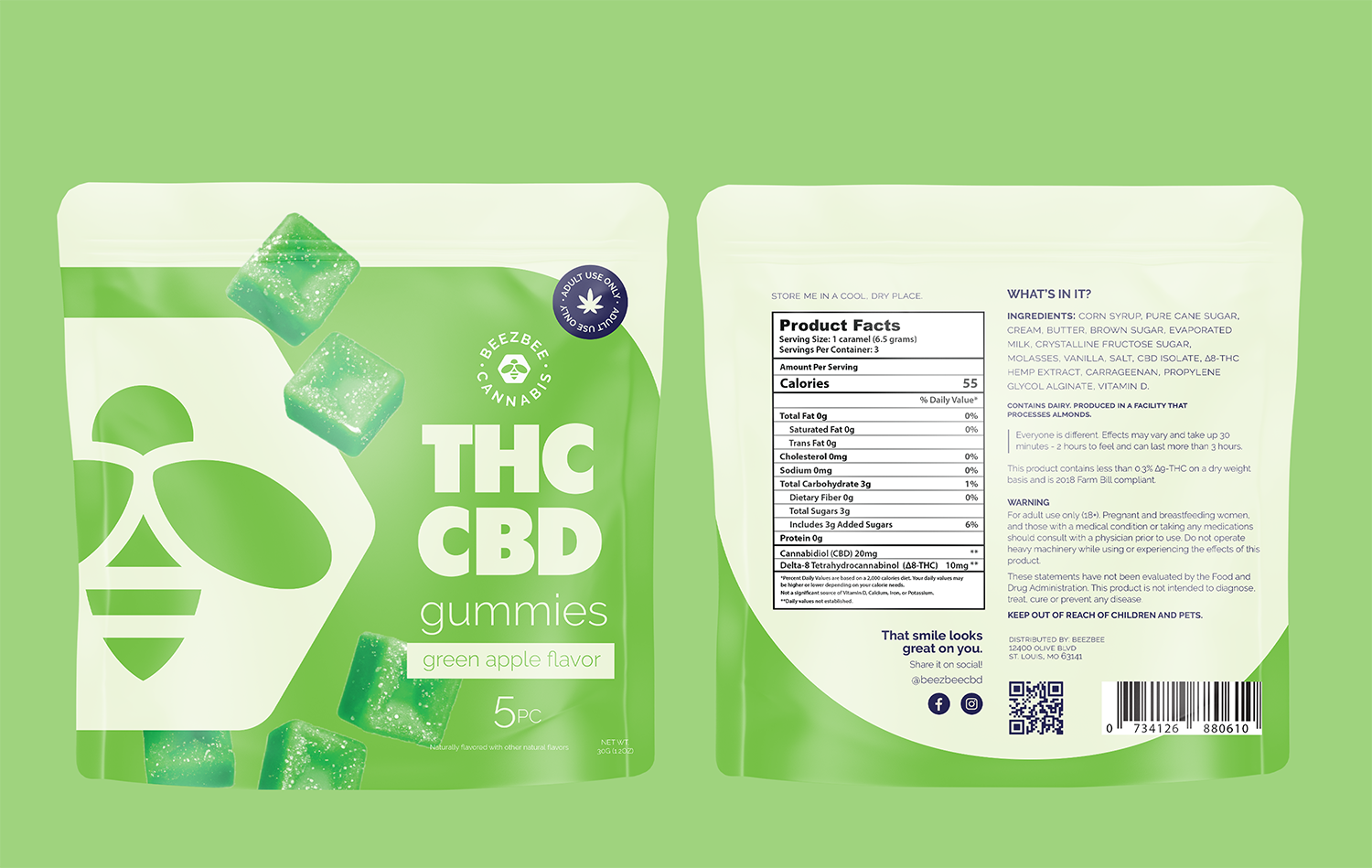
The flavor color version was a big hit with the owners, but wanted to lean even further into flavors, so I swapped the position of "THC" with the flavor name, to make it more bold and impactful. The first project was to design some limited edition sodas for the brand - just in time for summer!
FLAVOR COLOR VERSION


THE FIRST ITERATION
The initial design incorporates elements pulled from the old fun, and approachable brand style and offers a refreshing spin to current standards. It also invents some new assets to add some new, bold & eye-catching style into this brand.

Logo is versatile, bold and eye-catching. It can be put on almost any color and still stand out because of its bold font choice and outlined style.

This concept uses colors to distinguish between cannabinoid (like old standards), emphasizes flavor & product type through color, and also uses a strong brand color palette that acts as a pedestal for all the other colors to seamlessly live together, without becoming too much to digest visually.

Cannabinoid phrases are used the correlate the potential effects/benefits and will be color-coded with the established system. This brings awareness to what the product actually does to a mainstream audience who may not understand what a particular product is supposed to do for them.

Brandon Grotesque is pulled forward from the current branding, and will be the single font for the entire brand.
Kitten swash is to only be used for the logo.


- Brand colors (navy, white & peach) offer a solid standing ground for the other colors to maintain a sense of consistency & balance within the design. It also minimizes the potential rainbow of products as they are all placed together.
- Easy to identify between product type (color block at the bottom), flavor (large text) & cannabinoid (pattern color at the top) at a quick glance.
- Product type icons will correlate to the product type color, and the cannabinoid color on the tearaway will correlate to the quote color around the bottom hex - establishing the system to consumers.


- In the case of beverages, to offer a variety of colorways, I focused the main color to be “flavor color” (the concern was that the old beverages all appear similar with the white being the main color of all of them)
- The background will also receive flavor profile silhouettes, which will remove the pattern the the top and replace it with appealing phrases to steer it more to a mainstream audience & to reduce visual noise. The cannabinoid color now just becomes a solid fill rather than a pattern at the top.
- For the “product color” which is normally in the bottom hex shape, this will now become white + 50% tint of the flavor color so we can keep the flavor image container


- In the case of tinctures, where you’re really only buying the pure form of the cannabinoid, using the background color as the cannabinoid color will make it easy to distinguish between each type and match with the other products to add “enhancements” for a boosted experience.
- Branding still remains consistent in structure, and leans on the navy & white for brand identification.
- Since tinctures only take up a small amount of real estate in the stores, this would not become overwhelming in the store experience.
THE SECOND EVLOLUTION
A later iteration, heavily focusing on using yellow for the main brand color at the request of the company...


OLD BRANDING
